
A Japanese pattern does not depict a flower; it depicts the wind that blows through it.
If you have ever picked up a Japanese piece and wondered why a single maple leaf is painted on it, why the rim of a tea bowl is broken with a small white snowflake, or why a bamboo grove drifts across the side of a sake cup, there is almost always an answer — and the answer is usually a month. Japanese craft is seasonal by design. The motifs are not decoration. They are the wind moving through a particular part of the year, caught and held in clay, lacquer, or cloth, so that the room the object enters carries that wind too.
This guide walks through seven of the most cherished seasonal motifs in Japanese craft — the plum that opens the year, the cherry that follows it, the hemp leaf and the flowing water of high summer, the maple that closes autumn, the moon and rabbit of the harvest, and the snow-ring of deep winter. The aim is not to tell anyone which to choose, but to make the vocabulary easier to read, so that what you choose — for yourself or for someone else — carries the season you intend.
Seven motifs, four seasons, one quiet calendar — and how each turn is painted into form.
Reading the Year — A Brief Note Before We Begin
Long before commercial pattern libraries, Japanese visual culture treated the year as a kind of vocabulary. Each turn of the season had its plant, its weather, its small animal, its angle of light — and craft borrowed all of them. The literary version of this is kigo (季語), the season-words of haiku: a single noun is enough to fix the poem’s month. Craft works the same way. A single motif is enough to fix the season.
The basic grammar is simple. One motif on one piece reads as one season. Two motifs together, paired thoughtfully, often read as the passage between seasons — a maple leaf carried on flowing water, a plum branch beside a snow-ring. Three motifs are usually a wish folded into time: pine, bamboo, and plum together stand for endurance through winter into the new year.
The seasonal grammar is gentler in modern Japan than it once was, and many everyday pieces are now used year-round. But for formal occasions and considered gifts, the rules are still very much alive — and the pages that follow are an attempt to make those rules a quiet pleasure rather than a quiet anxiety.
Ume (梅) — The Plum That Refuses to Wait for Spring
Of all the flowers Japan has chosen to praise, the plum is the only one that blooms while the snow is still falling.
The plum is the year’s first flower in the Japanese imagination. It opens in late January and February, while the air is still cold and the garden ground is still hard, and that early arrival is the source of its meaning. The plum is not the flower that announces spring. It is the flower that endured the winter, and that endurance is the wish it carries: resilience, and the first quiet hope of warmer months to come.
The plum reached Japan from the Asian mainland in the Nara period, and for several centuries it was the flower the Japanese aristocracy preferred. The eighth-century Man’yōshū — Japan’s earliest poetry anthology — contains far more poems about plum than about cherry; the cultural shift in which the cherry overtook the plum came later, in the Heian period. In literary memory, then, the plum is the elder sibling of the sakura — quieter, less photogenic, but the one that tradition turned to first.
Colour note. A white plum (白梅, hakubai) reads as quiet and dignified — at home on new-year gifts to elders. A red plum (紅梅, kōbai) carries more visible joy, and suits small things given to younger recipients. Black-ground lacquer with the full shōchikubai trio (松竹梅 — pine, bamboo, plum) in gold is the formal extreme: a piece for the most considered new-year occasions.
Look closely at a plum blossom on Japanese lacquer — five petals, sometimes six, the painter’s hand sometimes adding a sixth where the eye expects symmetry but the plum itself does not. That extra petal is not a mistake. It is the painter’s small reminder that the flower they are drawing has a life of its own.
The plum is one of the most enduring of beginning gifts: pieces are chosen for the new year, for new homes, for a child’s entrance into school. Pieces in our collection carry plum on hand-painted Kutani teaware, on Arita small dishes, and on lacquerware reserved for the new-year table.
For more on how plum joins pine and bamboo to form the Three Friends of Winter, see our guide to seven lucky Japanese motifs.
In our collection: Arita Nejiri Ume — Plum-Shape Small Plate, Red
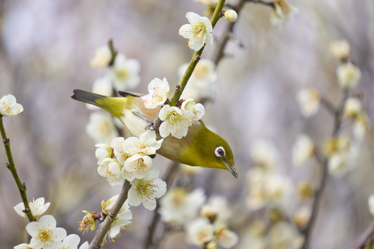
Sakura (桜) — The Bloom That Returns
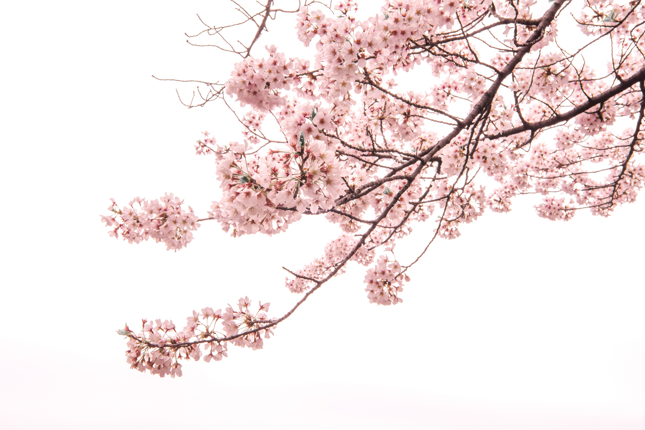
The cherry blossom belongs to Japan not because Japan owns it, but because Japan has spent a thousand years choosing it.
The cherry blossom became the national flower of Japan slowly. In the Heian period, courtly poets shifted their preferred subject from plum to cherry, and over the centuries that followed the cherry kept its place at the centre of the Japanese spring. Mono no aware (物の哀れ) — the gentle ache that things are beautiful because they pass — is most often illustrated by the sakura, because the sakura’s bloom is so brief and its falling so visible.
It is tempting to read the sakura mainly as the flower of brief beauty — the bloom that falls. But that reading is incomplete. The sakura is just as deeply the flower that returns. In the Heian aristocrat’s reading, the falling petal was ephemeral beauty. By the Edo period, when hanami (花見, flower viewing) had become a public festival open to townspeople and farmers, the same falling petal had become something closer to a festival of regeneration. The cherry that falls is the cherry that will return — and an entire country gathering under the same trees, year after year, to witness that return, is the meaning the motif now most often carries.
Colour note. A pale pink (薄紅, usubeni-iro) sakura reads as joyful and young, and is at home on pieces given for weddings, births, and the new arrivals of spring. A whiter, more subdued cherry suits gifts for elders. A deeper, almost magenta cherry — modern in feeling — sits well in contemporary interiors and on pieces meant for everyday rather than ceremonial use.
When painters render falling petals on lacquer, they often blur the petal’s edge — not because they cannot draw a clean line, but because a falling petal, viewed by the eye that loves it, is never quite in focus. The painter draws the way the eye remembers, which is to say, slightly soft.
A small craft point worth knowing: most of the cherry trees Japan grows along its avenues today are somei-yoshino, a single cultivar bred only at the very end of the Edo period. The cherries painted on older Japanese craft are most often yamazakura — the wild mountain cherry — with smaller, sometimes more pointed petals and less uniform colour. If a piece’s cherries do not quite match the modern street-tree image, that is usually a sign that the painter was looking at the older cherry, not the newer.
The sakura suits spring giving in almost any register — the small dish for a friend’s new home in April, the lacquer cup for a wedding, the textile for a child’s first school year.
In our collection: Pair Yunomi Kutani — Sakura, Yellow and Green
Find a piece that matches the moment in the year you want to mark — a beginning, a turning, a quiet ending.
Asanoha (麻の葉) — A Prayer in a Pattern
Six small lines, repeated until they cover an entire kimono — and yet each repetition is a wish for a child to grow.
The asanoha pattern is a hexagonal star — six straight lines radiating from a single point, repeated across a surface until the whole surface is rhythm. It is a mitate (見立て): a stylised reading of the hemp leaf, not a botanical drawing of one. The hemp plant was, in old Japan, the fastest-growing and most reliably upright of cultivated plants, and that observation became the motif’s wish: that a child grow as quickly and as straight as this. From the Edo period onward, asanoha was woven and stitched onto ubugi (産着), the first cloth a newborn was wrapped in, almost without exception.
The asanoha pattern moved through Japanese society in two very different registers, and the contrast is part of what gives it its present meaning. In the houses of the samurai, it was woven into formal silk — a geometric refinement, an emblem of order, the same six lines that made a child’s robe also lining the formal sashes of the warrior class. In the homes of Edo townspeople, the same pattern was stitched onto rough cotton, by mothers who had just given birth, one stitch at a time, with the wish that their child would grow as quickly and as straight as the hemp itself. Same lines, two very different prayers — and over time, the second tradition is what survived in living memory. The asanoha became, above all, a prayer in a pattern.
Once stitched into the first cloth, the asanoha was no longer just cloth. It was an object that carried a wish, in the way a small temple charm does. Omamori (お守り) is the Japanese word for such a thing — an object that has crossed, by intention, from utility into protection. The asanoha ubugi is one of the oldest examples in Japanese craft of a piece whose pattern is what makes it an omamori.
Colour note. Indigo (藍, ai-iro) is the classical reading — the deep, cooling blue of summer cloth and of the small ubugi garments stored in many old families. White on indigo carries a quiet clarity, and is the most common reading on textile gifts for newborns. Black ground with gold asanoha is the formal extreme, seen on the obi sashes of formal kimono; it is not the absence of colour but the night sky behind a child’s wish — the silence in which the prayer is most clearly heard.
Look at the centre point where the six lines meet, and notice that the painter has, very gently, missed it. Perfect symmetry would be machine work. The slight imperfection is the maker’s signature, and the child’s life that the pattern is praying for is no more symmetrical than that.
In gift tradition, asanoha sits at the centre of the new-baby register — pieces appear in our collection on hand-stitched bibs, on small-bowl tableware, on the furoshiki (風呂敷) wrapping cloth often sent with a baby’s first formal gift. Beyond that occasion, asanoha also reads as a quiet summer motif, at home on tableware and noren curtains for warmer months.
In our collection: Mino Chawan — Asanoha, Matcha Tea Bowl
Ryūsui (流水) — Giving Form to What Has None

Water has no shape, until a Japanese painter draws it.
Ryūsui (流水) is the motif of flowing water — long, sinuous, parallel lines drifting across the surface of a piece, usually horizontal, often interrupted, almost never closing into a shape. It is distinct from seigaiha (青海波), the stylised wave-pattern with its repeating arcs. Seigaiha is the surface of the sea seen from above. Ryūsui is a single river, seen from beside it. The first is geometry; the second is passage.
In meaning, ryūsui carries a quiet continuity — life moving on, things arriving and leaving, the passage of time as something that does not stop and does not need to. Hōjōki, the early-thirteenth-century essay by Kamo no Chōmei, opens with a sentence almost every Japanese reader has met in school: the river’s flow is ceaseless, and yet the water is never the same water. The line is one of the foundational statements of mujō (無常), Japanese impermanence — and ryūsui on craft, in a small but real way, is the visual version of that line.
In summer, ryūsui has a more immediate use as well: it cools the eye. A dish with flowing water painted on its inner glaze does some of the same work for the dining table that a fan does for the room. In paired motifs, ryūsui is one of the great bridges between seasons — flowing water with a cherry petal reads as late spring; flowing water with a maple leaf reads as autumn (the Tatsuta-gawa composition, met again in the maple section below).
Colour note. Indigo on white porcelain is the classical summer reading. Silver on black lacquer is the formal extreme — a line of moonlit river drawn across a winter sake cup. Gold on porcelain extends the motif into ceremonial register, often paired with cherry, pine, or maple to mark a particular season’s joy.
Trace one of the curves with your finger and you will reach a point where the line simply stops — a deliberate gap, the painter declining to pretend that water can be entirely drawn. The water continues; the line does not.
Pieces carrying ryūsui appear in our collection most often on summer tableware and on textiles meant for warmer months. As a gift, it suits the long-friendship and long-marriage register — the relationship that flows on, neither hurrying nor stopping.
In our collection: Kutani Mug — Waterside Flowers, Ginshu
Momiji (紅葉) — The Maple That Burns Quietly Against Stone
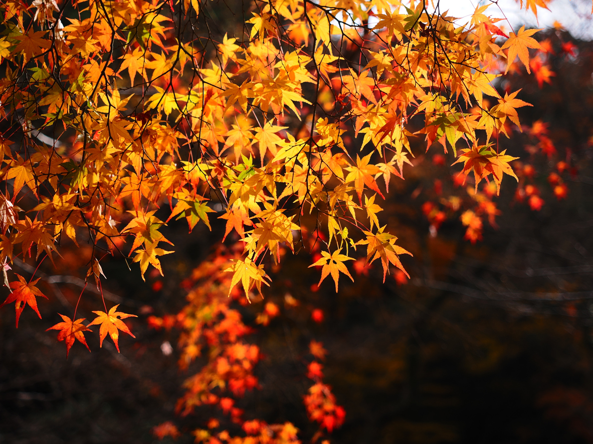
If sakura is the joy of beginning, momiji is the dignity of returning.
The maple, momiji (紅葉), is the autumn echo of the sakura. Where the sakura opens the year with pale pink against new green, the momiji closes it with deep red against weathered stone, and the relationship between the two is one of the great paired readings in Japanese aesthetics. Both motifs carry mono no aware. The sakura’s reading is the joy of arrival; the momiji’s reading is the dignity of completion — the leaf at its most rich, just before it lets go.
The Heian aristocrats developed a courtly game called momiji-awase — bringing the most beautifully turned maple branches to a small gathering and quietly comparing them, the way one might compare poems. The custom did not survive into modern life, but its aesthetic did: koyo-gari (紅葉狩り), maple viewing, is still the great public occupation of Japanese autumn.
In craft, the most enduring composition is the Tatsuta-gawa — the river of Tatsuta, named for an ancient waka poem by Ariwara no Narihira: the gods of myth never knew of such a thing — the Tatsuta River flowing in deep crimson, the water tied with leaves. The motif renders flowing water (ryūsui) with maple leaves drifting upon it, and the combination is one of the most cherished of all Japanese seasonal pairings — autumn arrived, autumn passing, autumn already half-remembered.
Colour note. Deep crimson (深紅, shinku) is the formal reading — the colour reserved for elders’ celebrations, milestone birthdays, and the most considered autumn gifts. Yellow-orange and ochre move the register toward warmth and the everyday — a small dish or teacup for the November table. Gold on lacquer (makie maki-e) is the most ceremonial: a piece at this register often marks a retirement, a kanreki (60th birthday), or another major life turn.
Notice the serration along each leaf’s edge. A Kyoto painter draws the small teeth precisely; a Kyushu painter often elides them, choosing rhythm over botany. The same maple, two regional accents.
Momiji has long been chosen as a gift for the autumn of a person’s life — retirements, milestone birthdays, late wedding anniversaries — where the wish behind the piece is the dignity of arriving here well. The motif appears across many Japanese craft traditions; for how it is rendered specifically in Arita porcelain, see our Arita Patterns guide.
In our collection: Arita Teshio-zara — Nejiri Momiji, Octagonal
Looking for a piece that marks a season — a birthday in autumn, a new home in spring, a quiet gift for the new year?
Tsuki to Usagi (月とうさぎ) — The Moon and the Rabbit
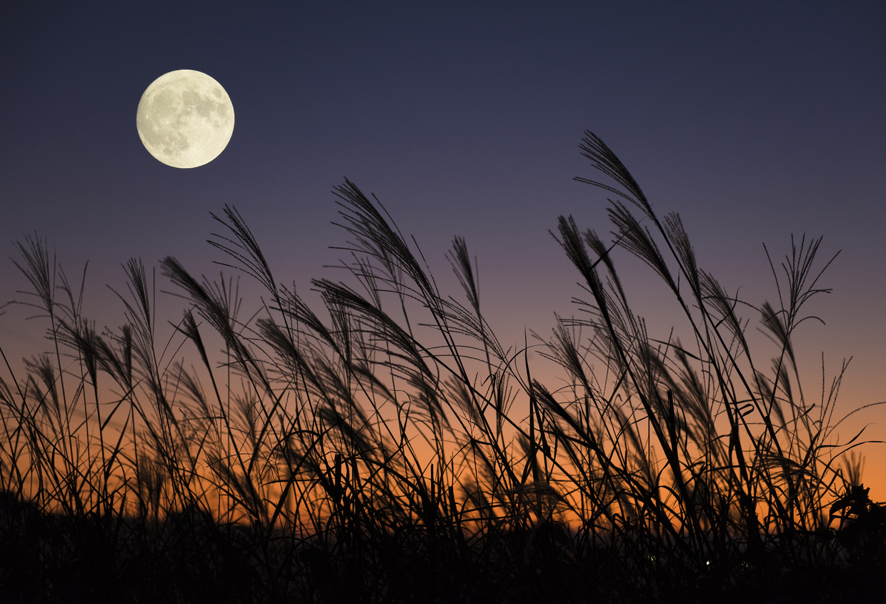
A rabbit pounds rice on the moon, and the whole of autumn folds into the image.
In the Japanese reading of the moon, the dark shapes on the lunar surface are not the Sea of Tranquility of the Apollo missions; they are a rabbit, pounding rice into mochi. The image is borrowed from older Indian and Chinese traditions and was naturalised into Japan many centuries ago. It is most strongly associated with jūgoya (十五夜) — the full moon of the eighth month of the old lunar calendar, falling now in mid-September to early October — when families gather for tsukimi (月見), moon viewing, with white dango on the windowsill and silver pampas grass in a small vase.
The rabbit alone has its own meaning: fertility, because rabbits multiply, and the leap forward, because rabbits jump cleanly. The moon alone has its own meaning too: completion, because the full moon is round, and constancy, because no matter the weather it returns. The two together compress the whole register of the harvest moon into a single image.
The story behind the motif is a Buddhist parable, gently held: three animals were asked for food by an old man, and only the rabbit, having nothing else, offered its own body. The old man, the king of the heavens in disguise, was so moved that he placed the rabbit’s image on the moon. The story is rarely spelled out on the craft itself — Japanese ornament prefers compression — but it is the warm bottom layer beneath the image.
Colour note. White rabbit on a silver moon is the classical reading, most at home on the autumn tea bowl or natsume (棗) tea-caddy. Gold lacquer with the moon, rabbit, and pampas grass is the formal extreme, seen on the tiered jūbako used for harvest-moon dining. Indigo with the rabbit reserved in white is the textile reading.
Look at the moon’s edge — the painter has, almost imperceptibly, drawn it slightly out of round. Not because they could not draw a perfect circle, but because the moon, as the eye remembers it, never is.
Black ground with a silver moon is one of the oldest compositions in Japanese craft. It is the colour that holds the night together, the colour against which the moon is most fully itself. Pieces in our collection carrying the moon-and-rabbit motif appear most often on autumn tea-ware, on the small dishes for harvest-moon sweets, and on textiles meant for the brief weeks between summer’s heat and the first cold.
In our collection: Kutani Oval Plate Set — Tsuki Usagi, Gold Moon & White Rabbit on Dark Ground
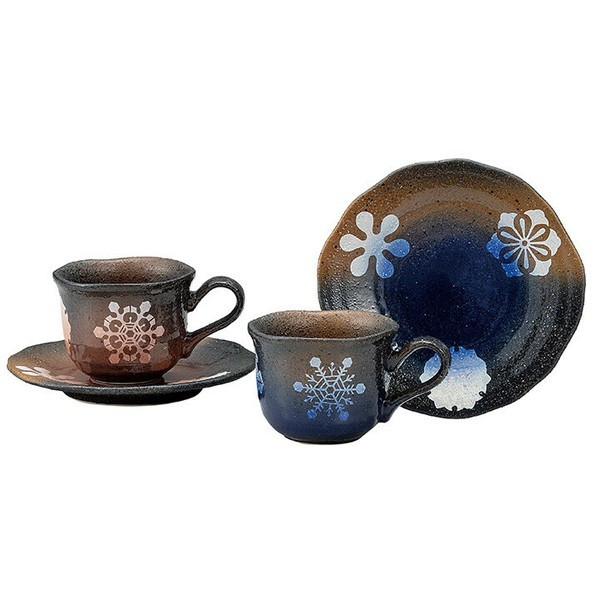
Yukiwa (雪輪) — The Snow-Ring Against the Black
A circle drawn with six small interruptions — and that small unevenness is precisely the snowflake.
Yukiwa (雪輪) is one of the most beloved winter motifs in Japanese craft: a circle, drawn with six small notches in its rim, which together signal the six-sided nature of a snowflake. The motif was codified during the Edo period, long before microscopes confirmed the snowflake’s hexagonal geometry. The Edo eye intuited the six-ness of snow somehow, and the yukiwa is the visual record of that intuition. Its central wish is purity and clean beginning — a fresh fall of snow over a dark garden, the year resetting. There is a quieter second reading: the yukiwa is also the winter piece’s way of waiting for spring, an object that holds the season carefully without holding it forever.
Black, in Japanese aesthetics, is not absence. It is the colour that holds — that frames, that protects, that lets a small white shape be most fully itself. The yukiwa rendered in white on a black lacquer ground is one of the most settled compositions in Japanese craft, and the reason is simple: it is silence around a snowflake. The eye that travels the bowl follows the rim of the white ring, finds the small interruptions where the snowflake is breaking, and returns again to the black — and the black is doing the same work the night sky does for the moon. This is why winter pieces in the highest register are so often dark. The black is not the background. It is the season’s listener.
Colour note. White on navy is the classical reading — the everyday winter dish, the new-year teapot. White on black lacquer is the formal extreme, reserved for the most considered new-year occasions. Gold and silver yukiwa on gold ground appear on the finest jūbako prepared for the first days of January.
The six interruptions in the ring are never identical. The painter knew, even without a microscope, that no two snowflakes have the same edge — and so each of the six gaps is given its own small irregularity. The yukiwa is a fragmentary motif: the circle is broken on purpose, and that breaking is what makes it snow rather than only a circle. Wabi-sabi (侘寂) — the Japanese aesthetic of beauty in incompleteness — finds one of its most quiet expressions here, and the yukiwa has long been one of the favourite motifs of the winter tea ceremony.
In gift tradition, yukiwa is a piece for the new year and the clean start — the most considered new-year sake cups, the jūbako for the first family meal of January, the small dish for someone who has just moved into a new home. It is also, traditionally, a piece given to someone in long convalescence: the snow that quiets a garden has, for a long time, been the visual prayer for the slowness in which a body recovers.
In our collection: Pair Coffee Cup & Saucer — Kutani Yukiwa, Dark Ground
Bringing It Together — A Pattern, the Wind That Blows Through It
These seven motifs do not exhaust the Japanese seasonal vocabulary. There are pampas grasses and chrysanthemums for autumn, irises and goldfish for high summer, camellia and pine for the deep cold of February. But the seven gathered here — plum, cherry, hemp leaf, flowing water, maple, the moon-and-rabbit, snow-ring — form a small, well-balanced calendar. Each motif is enough, alone, to fix a season. Each motif rewards the kind of attention that lingers a little.
Two final practical readings. Mixing seasons on the same table — a spring dish next to a summer cup — is, for formal occasions, generally avoided; the Japanese sense of the table prefers a single clear season per meal. Conversely, gathering several pieces from the same season — the dish, the small bowl, the noren curtain at the doorway — is one of the simplest ways to make an entire room feel like a single line of haiku. In modern Japanese life the rules have softened: many homes now keep their everyday tableware year-round and reserve the seasonal pieces for considered occasions and gifts. There is no wrong way to begin.
And so a Japanese pattern, in the end, does not depict a flower — it depicts the wind that blows through it. To learn to read these motifs is, in a small way, to learn to read time the way Japan reads it.
A Note from the Shop
We carry the work of artisans across Japan whose pieces fall, deliberately, into the seasonal vocabulary above. Each piece is chosen because the season it carries is the season we wanted to live with for a while, and because the maker’s hand is one we trust.
Something we have noticed over the years: a number of customers choose a piece not for the season they are in, but for the season they want to remember. A sakura cup bought in October. A yukiwa dish brought home in July. We have come to think of this as its own kind of seasonal awareness — the calendar of kokoro no kisetsu (心の季節), the inner season — and the next page of this guide returns to it more carefully.
There is no rule in our shop that says one must wait for the right month to choose a piece. Bringing a season home is itself a small act of self-care, and an old Japanese tradition called hashiri (走り) — the aesthetic of the early — has, for centuries, supported exactly this gesture.
— from Osaka, Team Manekineko-Ai
Pieces in Our Collection Carrying These Motifs
A few examples of pieces in our collection that carry the seasonal motifs in this guide. These are examples, not recommendations.

Pair Yunomi — Kutani Sakura, Yellow and Green. A pair of hand-painted Kutani yunomi: white sakura scattered over warm yellow and spring green. Two cups, one season — the morning sun and the spring grass, held in the hand. (See the pair)

Arita Teshio-zara — Nejiri Momiji, Octagonal. A small Arita octagonal plate with blue maple leaves drifting along a twisted line. Small enough for a single sweet, deliberate enough to be looked at — the autumn dish that sits beside the late afternoon tea. (See the piece)
Pair Coffee Cup & Saucer — Kutani Yukiwa, Dark Ground. A pair of Kutani coffee cups and saucers: white snow-rings resting on a dark earth-toned ground. The kind of cup that, set on the morning table, makes the room feel a little more still. (See the pair)
Frequently Asked Questions
Q: I am new to Japanese crafts. Which motif is the most versatile for year-round use?
A few of the motifs above have a long secondary tradition as kichijō-monyō (吉祥文様) — auspicious patterns — that read as appropriate at any time of year. The asanoha hemp-leaf is the most common: although it is, in a strict reading, a summer pattern, it has been used year-round on baby goods, on textiles, and on everyday tableware for so long that no Japanese person would now be surprised to see it in February. The yukiwa snow-ring, perhaps surprisingly, has a similar second life — on its own, on a small tea bowl, it can pass for clean beginning at any time. If you would like a first piece that does not need to wait for the right season, an asanoha cloth or a yukiwa dish is a kind starting point.
Q: Is it inappropriate to give a piece with a motif from a different season?
Modern Japan has relaxed this rule for everyday tableware, and there is wide latitude in casual giving. For formal gifts — wedding presents, retirement gifts, considered anniversary pieces — choosing a motif close to the season of giving is still considered most thoughtful. Outside formal occasions, however, the most beautiful pairings sometimes come from the gentle act of bringing a different season into the room: a yukiwa cup for a friend who is moving in midsummer, a sakura dish for a colleague leaving in autumn. The intention is what reads, and the season the giver chose is part of the gift.
Q: Can I buy a seasonal piece for myself, even out of season?
Yes — and there is a long Japanese tradition that supports the gesture. The aesthetic of hashiri (走り) — the early — values the deliberate use of a thing slightly before its natural season, the way an autumn tea master will set out a yukiwa tea bowl in late autumn while the leaves are still falling, anticipating the snow that has not quite arrived. To use a yukiwa cup in midsummer is, in a very Japanese sense, to keep a small coolness in your own hand. The calendar outside the window is not the only calendar that matters. The season your inner attention has chosen — the kokoro no kisetsu — is its own quiet kind of season, and choosing a piece for yourself, in or out of step with the date, is the simplest way of inviting a particular kind of weather into your own life.
Q: What does it mean when multiple seasonal motifs appear on the same piece?
Layered seasonal motifs almost always mark a transition rather than a confusion. The Tatsuta-gawa (maple-and-flowing-water) reads as late autumn turning toward early winter; the shōchikubai (pine, bamboo, plum) is a new-year composition. When two motifs appear together, look for the season between them.
Q: Are seasonal motifs only for tableware, or do they appear on other crafts?
Seasonal motifs run across almost every Japanese craft tradition — lacquerware, porcelain, noren doorway curtains, furoshiki wrapping cloths, kimono and obi sashes, wagashi (Japanese sweets) and the boxes they are sold in, hand-fans, and even the paper used for formal letters in season.
Q: How do I tell which season a motif belongs to if I’m not sure?
The simplest reading: a flower is in season when it blooms. A plant is in season when it is the colour the motif paints it. Water is summer when it flows clean and blue, winter when it carries snow. Animals are season-marked too — the rabbit and moon are autumn, the goldfish is summer, the swallow is early summer. When in doubt, look at the colour scheme: pale pink and pale green together read as spring; deep red, ochre, and gold together read as autumn; navy or indigo with white reads as summer; navy and gold with white snowflakes reads as deep winter.
Q: Are these traditions still observed in modern Japan?
In everyday life the seasonal grammar has loosened. Most modern Japanese kitchens have a few year-round pieces and bring out the seasonal pieces for particular occasions. But the grammar is not gone: at any considered occasion — a formal dinner, a wedding, the new-year table, a tea gathering — the seasonal piece is still chosen with care, and the motif is still read by everyone present.
Q: Where in the home should I display a seasonal piece?
Traditionally, the seasonal piece sits in one of three places: the tokonoma (床の間, the formal display alcove), the entrance hall (where a seasonal noren curtain announces the season to anyone arriving), and the dining table. Modern interiors without a tokonoma often substitute a small shelf or a windowsill — anywhere a piece can be looked at without competition.
Closing — The Wind, and What It Carries
To choose a piece with one of these motifs is, in the end, to choose a small painting of the wind — and to bring that wind into your own room for a while. Each season in Japan has been chosen, slowly, into a small set of motifs that even a stranger to the country can begin to read. The plum that endured the winter, the cherry that returned with the spring, the hemp leaf folded into a child’s first cloth, the river that gave form to what has none, the maple that closed autumn well, the moon and the rabbit who waited together for harvest, the snow-ring against its quiet black — these are seven of the windows through which Japan has, for centuries, watched the year.
For motifs grouped not by season but by the kind of luck they carry, see our guide to seven lucky Japanese motifs. For the story behind the cat that sits at the door of this shop and quietly invites the year in, see the story of the maneki neko.
Thank you for reading.
— from Osaka, Team Manekineko-Ai